

Under the skin of an award-winning rebrand
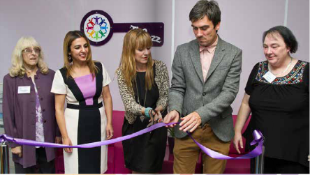
![]() When our client The Kaleidoscope Plus Group got in touch to ask if we’d be interesting in attending or sponsoring their Gala Ball in celebration of World Mental Health Day we jumped at the chance to do both!
When our client The Kaleidoscope Plus Group got in touch to ask if we’d be interesting in attending or sponsoring their Gala Ball in celebration of World Mental Health Day we jumped at the chance to do both!
So we’ll be donning our glad rags and joining them at their lovely new premises in West Bromwich on Thursday 9th October for a glitzy evening of fun and laughter, with a headline set from the rather brilliant Nina Conti.
We’ve worked with the charity for several years, providing social media support and creating various brand assets and communication materials for them. We’re currently working with their Communications team to collate and publish the charity’s 2013/2014 annual review.
Back in 2013, at the time of their transition from Sandwell Mind to Kaleidoscope Plus Group, we helped them create and communicate their new brand, work we’ve since won a highly prized Institute of Internal Communications award for.
If you’re curious as to what a rebrand involves or interested in finding out more about exactly who The Kaleidoscope Plus Group are, you may enjoy the extended case study below…
Background
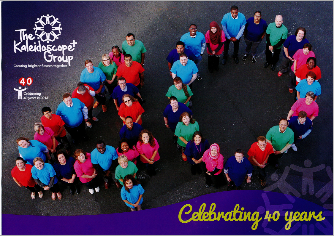
The Kaleidoscope Plus Group is a registered charity established in 1973 and is one of the leading mental health charities in the West Midlands.
It works to promote and support better mental health and is committed to making sure that the services and facilities provided are of the highest quality and that it continues to develop to meet the needs of the communities it serves.
The organisation has a board of voluntary trustees who are responsible for the overall management and direction of the charity and its services. The day to day responsibility for managing the organisation’s activity is delegated to a team of paid staff who are accountable to the Trustees.
In 2013 the charity underwent a major restructuring and rebranding exercise, changing its name from Sandwell Mind to The Kaleidoscope Plus Group. This was as a result of a decision to disaffiliate itself from the national Mind organisation so that it could deliver a broader spectrum of activities and a more holistic approach to health and wellbeing – something that the affiliation with Mind had not allowed.
Once the strategic decision had been made to change the name and rebrand, the executive team were keen to involve employees, and indeed all stakeholders, in the change process at every stage.
Following a tendering exercise, CW was invited to manage every aspect of the campaign from initial employee consultation and feedback, through brainstorming ideas for names and logos, to designing and fine-tuning the look and feel and creation of the final brand guidelines and templates for various communications materials including stationery, pull-up banners and appointment cards.
Why change?
In the words of our client:
It had become clear that being part of Mind, and named ‘Sandwell Mind’, pigeonholed us into a specific type of service provision. It restricted us geographically both in the eyes of Commissioners and service users – when in reality we were offering so much more, which wasn’t being recognised. This limited opportunities available to us and as a result, our future as a charity, the services we offer and our staff’s jobs. We weren’t able to bid for new contracts we wanted to go for, and in an increasingly competitive ‘local services’ market, we couldn’t prevent others from bidding for any of our services when they went out to tender.
Service users also felt they were being labelled unfairly; yes they had a mental health problem, but their problems were much more complex – some people also have physical impairments, learning difficulties, long term health or personal problems which all contribute to who they are. However, they felt being a ‘Mind’ service user meant their mental health condition always defined them.
It was these elements that led to the universal thinking we needed to disaffiliate from Mind and drive forward in a new ‘future proof’ direction.
No-one really welcomes and relishes change, but where change can be genuinely demonstrated to be for the positive and promises a bigger, better and brighter future for all, it becomes essential and we believe the easy decision would have been to have made
no decision.
Involving employees, service users and stakeholders in the process
A five-phase rebranding plan was launched through a staff briefing in which the decision was announced to ensure they felt involved from the outset and able to contribute positively.
Phase One: Research/stakeholder engagement
To secure staff, service-user and commissioner buy-in by inviting feedback we undertook focus groups and distributed questionnaires to ensure the new name, look and feel reflected and reinforced the genuine values that already existed.
We formed a rebranding team with representatives from every part of the organisation to reflect each service and to ensure two-way dialogue. A progress update was also sent to staff from the CEO every Friday throughout the entire process.
Phase Two: Concepts and fine-tuning
We experimented with various names and then through further consultation a shortlist of names were created. An important consideration was that the name, logo and overall impression was aspirational as well as reflective.
This was shared with the Exec Team who presented the favoured alternatives to the Board of Trustees for a final decision.
Phase Three: Creation of Guidelines
The new name had now been approved and from this, the all-important brand guidelines were created to allow both employees and third party suppliers to instantly understand what the charity stands for.
Phase Four: Internal Roll-Out
As staff had been involved and consulted from the outset we initially had an internal launch day featuring a CEO briefing plus new stationery and merchandise handed out to staff.
Phase Five: Official Launch
We made the new name and branding public through a range of press releases across a wide range of communication channels including social media. We also held an official launch in which we were joined by celebrities who had been affected by mental health problems.
The new brand guidelines
How the new branding and communication campaign supported the organisation’s goals and objectives
Having gained buy-in from employees and stakeholders for the change, it was essential they were involved in deciding what the actual name, logo, look and feel would be.
To achieve this we facilitated focus groups and distributed questionnaires, and used the findings to inform our creative approach. The board shortlisted their preferred options and shared these with the rebrand team and a wider selection of stakeholders who made the final selection.
Again, in the words of the client:
We believe the name The Kaleidoscope Plus Group brings all the elements together to demonstrate that we are a multi-faceted, people-focused charity, working collectively to enrich and bring colour into the lives of those we are here to help.
When making the decision on the name, we asked our service user forum to feed back their thoughts on the shortlisted names, and how they relate to our mission and values as a charity. Kaleidoscope Plus was a clear favourite.
They liked the similarities of the kaleidoscope concept being many tiny little parts and that when the are put together everything makes sense.
They also liked the idea of it being ever changing and the thought of a new life to the one they have. They also linked it to lots of groups and services all coming together under one name and thought it fits us well.
Whilst there was some minority concern that the concept may not be obvious to everyone, the positives were considered to outweigh the negatives
by some margin.
The visual representation also reinforces our mission of bringing all of our services and the people we help into one ‘family’ environment.
Feedback and evidence that the changes have been successful and met objectives
There has been extensive evidence, even in the early stages following the rebrand in April, that it has been beneficial to the charity both internally and externally.
Within the organisation the challenge was to ensure everyone fully understood and embraced the reasons for the change and we believe this was swiftly achieved, largely by keeping all stakeholders fully informed every step of the way, taking on board and addressing any concerns and involving them in the final decision-making. Certainly the initial feedback and positivity of staff has been very encouraging.
The primary goals of the external messaging were about breaking the association with the old name, creating an attachment to the new name and explaining why the change will benefit service-users.
The feedback from service-users has been very encouraging and the change of name to The Kaleidoscope Plus Group has been extremely well received.
A key factor in disaffiliating and rebranding was to allow the charity to be more competitive when tendering and also to work outside of Sandwell. In a matter of only a couple of months, Kaleidoscope had already tendered for new contracts in new geographical areas, winning one and being shortlisted for another. Since then further contracts have also been secured.
In terms of raising profile and awareness, social media numbers and engagement have increased and in only a couple of months over 900 followers were achieved on Twitter. Kaleidoscope has also received a wide range of publicity both in local and regional press as well as national third sector publications. This includes BBC Radio WM asking for help to plan a special week on mental health issues and Midlands Today approaching the charity for comments on relevant topical news items, when previously they would have gone to Mind.
Video Evidence
To show how employees feel about their organisation and what the new name, look and feel means to them, we made the following video which can be viewed here:
And here you can see footage from the official Launch Day of The Kaleidoscope Plus Group which includes feedback on the rebranding activity:
Leave a Reply