Not just a pretty (type) face
How typography can make or break your content (and your business card)
It is a design masterpiece. It is mindless corporate chic. It is New York City subway. It is Nazi soldiers marching in line.
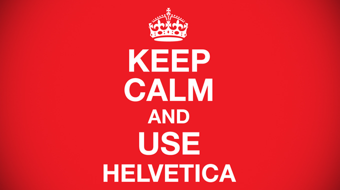
When you use Helvetica, you use more than an unassuming Swiss typeface.
The world’s most popular font is revered and reviled in equal measure. People make ‘quietly captivating’ documentaries about it (see 2007’s The Life and Times of a Typeface) and ‘typophiles’ even shave it into their heads (see the mind-boggling photos on the curiously-titled f**kyeahHelvetica Tumblr). While others spend hours creating homemade Helvetica characters to spell out words like ‘evil’, ‘hate’ and ‘hell’.
But it is not the only sans-serif to spark heated debate and protest. Just four days ago the Ban Comic Sans movement boasted on its blog: “We’ve reached 100 signatures on our petition to ban this plague of our time from Gmail.” The movement’s founder, Holly Combs, argues that “using Comic Sans is like turning up to a black-tie event in a clown costume”.
The point is that people care about fonts. They respond to them subconsciously and, increasingly, emotionally. Your choice of typeface sends out a powerful message to your audience, and the way you dress your words will be judged.
When typography is done well it can have enormous impact. Volkswagen’s pioneering use of the Futura font in American press ads of the 1950s and 60s started a minimalist trend in advertising that continues to this day. But when done badly, it can result inyour words being dismissed before they are even read. A business card in Arial won’t bring you much business.
So next time you plan a marketing campaign, or a new business card, think very carefully about your choice of typeface. It could transform your words from clowns into kings.


